There is no universal cap embroidery size. For a lot of front-cap work a practical range is around 4–5 inches wide by 2–2.5 inches high, and most jobs land near the middle of that. But the usable area is set by the cap in front of you — its crown profile, panel shape, seam, model, the placement you want, the frame it runs on and whether the design is flat or raised.
Every figure on this page is a typical working range, not a manufacturing limit. Treat them as a starting point for a conversation with whoever is sewing the job, and confirm against the specific blank.
Sizes at a glance
| Cap type / placement | Typical width | Typical height | Notes |
|---|---|---|---|
| Structured / mid-profile front | 4–5 in | 2–2.5 in | Buckram gives stability and holds detail; actual height depends on crown profile and model |
| Low-profile / dad hat front | 3.5–4 in | under ~2 in | Lower crown leaves less vertical room |
| Side panel | ~2–2.5 in | ~1–1.25 in | Eyelets, seams and a steeper curve cut into the space |
| Back, above the closure | ~2.5–3.5 in | ~1–1.25 in | Closure, keyhole and hardware set the limit |
| Trucker front | Varies too widely to state | Foam-front construction and crown profile differ enough between models that published figures disagree by inches. Check the blank | |
| Beanie cuff | Quoted per style | Cuff depth and whether it is worn folded change the area completely. Sources disagree too widely to publish a range | |
| A common cap-frame sew field | 5 in | 4.5 in | What the frame can reach — not a design size. See below |
Four numbers get called “cap embroidery size”
This is where most confusion starts, because four different measurements share one name and only the last two are what you should design to.
- The frame sew field. What the cap frame and machine can physically reach. A common commercial cap frame covers roughly 5 inches wide by 4.5 inches tall.
- The blank’s decoration area. What the manufacturer of that specific cap says can be decorated on it. Varies by model, and often is not published at all.
- The practical logo size. What will actually stitch cleanly on the part of the crown that stays flat enough to sew.
- The visually balanced size. What looks right on the cap rather than filling it.
The gap between the first and the third is the one that catches people out. A frame reaching 4.5 inches vertically does not mean a 4.5-inch logo — well before that height the crown has curved away from the needle and the design stops sitting flat. The frame is a reach, not a recommendation.
The front
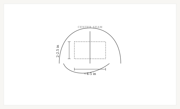
Height is the constraint people underestimate. Across decorator and supplier guidance the front figures cluster tightly on height — roughly 2 to 2.5 inches — and much more loosely on width, where published recommendations run anywhere from 3.5 to 6 inches depending on the cap and who is measuring. If you need one number to start from, start from the height.
Crown profile, not structure
It is tempting to sort caps into structured and unstructured and stop there, but that is the wrong axis for sizing. Crown profile and panel shape mostly determine how much usable vertical area exists. Structure and buckram mostly determine stability — how well the panel supports fine detail and dense stitching without distorting.
The two often travel together, which is why they get confused: a dad hat is usually both unstructured and low-profile, so its height limit gets blamed on the missing buckram when the low crown is doing most of the work. A tall unstructured cap and a low-profile structured one do not behave the way the labels suggest. Ask about the profile, not just the construction.
Side and back
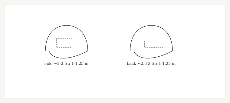
Both are small, and both are constrained by hardware rather than curvature alone. On the side you are working around the eyelet and the panel seams, on a steeper curve than the front. On the back the closure — strap, buckle, snaps or keyhole — sets a hard ceiling on height, which is why back placements are usually wide and shallow, often a single line of arched text.
On a trucker, the plastic snaps need clearing as well. Leave a buffer rather than running to the edge of what fits.
Where it sits vertically
Height on a cap is two questions, not one: how tall the design is, and how far up the panel it sits. The second is the one that gets decided by default and then regretted.
A design set low, close to the bill seam, runs into the part of the front that is hardest to hold flat and hardest for the presser foot to clear. A design set high runs into the crown curving away from the needle, and on a low-profile cap that happens sooner. The workable band is the middle of the panel, and it is narrower than the panel looks.
Leave visible clearance above the bill rather than measuring to the millimeter — how much depends on the cap, and it is one of the things worth confirming with whoever is running the job. What you can rely on is the direction of the trade-off: gaining height at the top costs you flatness, and gaining it at the bottom costs you clearance.
Where the center seam changes things
On a six-panel cap a seam runs down the middle of the design area, and it is the thickest point on the front. For sizing and placement that matters in three ways:
- A single unbroken element crossing the seam can be to climb it and come back down, so wide solid shapes and long satin columns are harder to place centrally than their width alone suggests.
- Vertical elements and fine detail sitting directly on the seam are the first things to look wrong. Either center them deliberately or move them clear.
- Raised elements should not cross the seam at all.
Why the seam causes registration trouble, and what to do when a cap has already sewn badly, is a separate subject. Why cap designs drift →
Arched text costs height you did not budget for
Arched lettering is close to standard on caps — across the front above a mark, and around the back above the closure. It is worth knowing what an arch does to the numbers.
A straight line of half-inch letters occupies half an inch of height. Put the same line on an arch and the overall height is the letter height plus the rise of the arc, because the ends sit lower than the middle. The deeper the arch, the more vertical room the line eats, and on a cap front that height is being taken out of an already small budget.
Two practical consequences. On the front, an arched tagline over a logo often does not fit at the letter height it needs, and the honest fix is a shallower arch or a straight line rather than smaller type. On the back, where height is capped by the closure and width is the resource you actually have, a shallow arch is usually the right shape — it uses the width without climbing into space that is not there.
3D puff needs more room
Raised embroidery changes the sizing conversation. Foam has to be fully enclosed by the stitching and then torn away cleanly, which needs wider satin columns and taller letterforms than the same design would need flat. A logo that fits comfortably at 2 inches flat may not work raised at the same height.
Published minimums for puff column width and letter height vary enough between sources that stating one here would be misleading, and they depend on the foam thickness being used. If part of the design is going to be raised, say so when you order and size it around that.
How a raised build differs from a flat one. 3D puff digitizing →
Small text on a cap
Cap fronts push lettering toward its limits: the panel curves, the backing is stiff, and the height budget is small to begin with. Taglines and secondary lines are usually the first casualty of shrinking a logo to fit.
Minimum letter heights are their own subject and depend mostly on the fabric. Embroidery lettering sizes →
Measuring the cap yourself
If you have the blank in hand, measuring beats any published range. Three things to watch:
- Measure it in the shape it is worn. A cap pressed flat on a table reads wider than it is, because you have flattened a curve that will be curved again on the head and in the frame. Hold the crown in shape and measure across the front.
- Measure between the seams, not edge to edge. The usable width stops where the side panels start, not where the cap does.
- Take the height from the bill seam upward, and stop where the crown starts to fall away from you rather than at the top of the panel. That is the honest number, and it is usually smaller than the panel.
Whatever you measure, take something off it. A design sized to the exact usable area has no margin for the small differences between one cap and the next in the same carton, and caps do vary.
What to give your digitizer
Six things, and the file comes back right the first time:
- The cap model, or at least the profile and construction
- The placement — front center, front offset, side or back
- The finished width you want
- The finished height you want
- Flat or 3D puff, and which elements are raised
- The artwork, and any requirement to clear a seam or a closure
If you know the cap you are running, send it. The model tells a digitizer more about the usable area than any published range can, and it is the one input that removes the guesswork.
Ready when you are