There is no universal left chest embroidery size. A practical adult left chest logo is often 3 to 4 inches wide, and around 3.5 inches is common for a horizontal logo — but width on its own does not settle it. The finished size depends on the shape of the mark, the cut of the garment, how much clear chest area there is, whether the shirt has a pocket, where the design sits vertically, and what looks balanced rather than what fits.
Everything below is a decorator convention and a practical starting range. None of it is a manufacturer specification, because the garment makers do not publish one — see where these numbers come from.
Sizes and placement at a glance
| Garment / situation | Typical width | Placement |
|---|---|---|
| Adult polo | 3–4 in | 7–9 in down from the shoulder seam; centered between placket and side seam, or 4–6 in from the placket |
| Dress or work shirt, no pocket | 3–4 in | The polo figures. The pocket, not the shirt, is what changes |
| Shirt with a chest pocket | Capped by the pocket width | Centered above the pocket, or on it |
| Jacket | 3–4 in | 6½–8 in down from the shoulder seam, about 4 in from the center line — higher than a shirt. Clear the zipper and any flap |
| Hoodie or sweatshirt | 3–4 in | Shirt figures. Clear the pouch pocket and the drawcord |
| Women’s cut | Lower end of the range | Same measurement from the shoulder seam, then checked against the placket and the armhole — see below |
| Youth | Scaled to the garment | Proportioned to the chest panel, not measured to adult figures |
| Lightweight performance knit | Lower end of the range | Placement unchanged; the fabric caps the practical size |
| A common small hoop’s sew field | about 3.9 in | What the hoop can reach — not a design size. See below |
Where these numbers come from
Worth saying plainly, because most pages on this subject do not. The large blank suppliers do not publish decoration placement specifications for their garments. What exists instead is a set of decorator and supplier charts that broadly agree with each other, and the figures on this page are drawn from those: two published placement charts, and size guidance from embroidery companies and hooping-equipment makers.
So treat every number here as a convention with good agreement behind it, not as a specification. On a garment you have in hand, the garment wins.
Four inches of field is not a four-inch logo
A print-on-demand platform will tell you the left chest area is 4" × 4". A small embroidery hoop gives a sew field of about 3.9 inches square. Both are true and neither is a recommendation — and the second one comes with a production rule attached: the design wants to be roughly an inch smaller than the hoop, so a 4-inch hoop is not a 4-inch design.
What the field can reach, what will sew cleanly, and what looks right on the shirt are three different numbers, and the third is almost always the smallest. A logo run to the edge of the available area crowds the sleeve seam and reads as oversized long before anything technical goes wrong.
Where a left chest design sits

Placement is better documented than size, and the published charts agree on the vertical: roughly 7 to 9 inches down from the shoulder seam for adult shirts and polos. Note the reference point — the seam, not the collar and not the neckline. Measurements taken from the collar produce numbers about half the size, which is where some of the stranger figures on the web come from.
Two horizontal conventions, two starting points. Horizontally, published charts look like they disagree. One gives 4–6 inches from the placket. Another gives 3–5 inches from the center line. Both also offer the same fallback: center the design between the placket and the side seam.
They disagree less than they appear to. A placket sits about half an inch off the center line, so converting the first convention to the second puts it at roughly 4.5 to 6.5 inches from center — overlapping the 3-to-5 range rather than contradicting it. Most of the apparent disagreement is the starting point, not the placement.
Which is the practical lesson of this whole page: a placement number means nothing until you know what it was measured from. When you brief a job, say it — “4 inches from the placket” and “4 inches from center” put the logo in two different places.
Logo shape changes the size
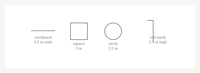
This is the part that most size advice leaves out, and it is why one person’s 3.5-inch logo looks right while another’s looks enormous. The eye judges area, not width. A 3.5-inch wordmark is a thin band. A 3.5-inch circle is a disc covering several times as much of the chest. They are the same number and a completely different result.
| Logo shape | Practical starting range | Which dimension controls |
|---|---|---|
| Horizontal wordmark or lockup | About 3–3.5 in wide, up to 4 in | Width. Height follows from the artwork |
| Square mark or crest | Around 3 in or below | Both, and the area is what you are really setting |
| Circular badge or roundel | From about 2.5 in across | Diameter. Circles read larger than their width suggests, so the low end usually looks right |
| Tall or vertical mark | About 2–3.5 in high | Height. Setting a width here gets you the wrong logo |
These are decorator conventions and starting points, not limits a machine enforces. The useful way to hold them is as a bounding area — a maximum width and a maximum height — that different shapes fill differently, rather than one rectangle every logo has to be squeezed into.
There is a decorator’s trick worth knowing: hold a business card to the chest. At 3.5 by 2 inches it is close to where most left chest logos land, and it answers the question faster than a tape measure does.
Polo, shirt, jacket, hoodie
Less varies than you would expect. Dress shirts and work shirts take the polo figures — what changes them is the pocket, not the shirt. Hoodies and sweatshirts are grouped with shirts in the charts too; the pouch pocket and the drawcord are clearance problems rather than sizing ones, and on a zip hoodie the zipper takes the place of the placket as the thing you measure from.
Jackets are the real exception. One supplier chart puts a jacket left chest at 6½ to 8 inches down from the shoulder seam and about 4 inches over from the center line — higher on the body than a shirt. That rests on a single chart rather than a consensus, so treat it as one house’s convention, and check it against the specific jacket: zippers, seams, chest flaps and panel breaks all move it more than the garment category does.
Pocket or no pocket
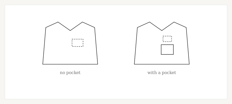
With no pocket, the shoulder seam and the placket or center line set the placement, as above.
With a pocket, that changes: the pocket becomes the thing the design lines up with. The published charts give two options — centered above the pocket, or on the pocket itself — and once you are working to the pocket, the seam measurement stops being the deciding number.
The size consequence catches people out. A chest pocket is usually narrower than the clear area next to it, so a pocketed work shirt is one of the common reasons a logo has to come down in size. Sizing to the pocket rather than to the chest is the fix. Exact clearance above a pocket is not something the sources agree on closely enough to publish a figure for; a small, even gap that looks deliberate is the working standard.
Women’s and youth garments
You will find charts telling you to place a women’s logo one to two inches higher than a men’s. That rule is repeated widely and sourced nowhere, the number drifts between pages that state it, and it reasons from bodies rather than from garments. We are not going to publish a figure we cannot stand behind.
The garment-led version is more useful anyway. Women’s cuts are shorter from shoulder to chest and often have a shorter placket, so the same measurement taken from the shoulder seam lands lower on the garment relative to everything around it. In practice that means starting at the lower end of the 7-to-9-inch range and then checking the result against the placket, the armhole and the amount of flat chest panel actually available — on the specific shirt, not on a chart. A narrower cut also tends to want the lower end of the width range, for the same reason.
Fabric, briefly
Fabric mostly changes how a file is built rather than how big it should be, and that belongs elsewhere. One exception is worth knowing about: tight performance knits. A lightweight moisture-wicking polo has less body to support stitching than a heavier one, and decorators working with them recommend keeping to a small left chest rather than a large design. Heavier performance fabric handles more.
Piqué and performance knits change the build more than the dimensions. Polo shirt digitizing →
Small text is what breaks first
Shrinking a logo to fit a left chest shrinks its text with it, and text has a floor that has nothing to do with the chest area. If a mark has a tagline, a web address or a strapline under it, check that line against the minimum before settling on a width — it is usually what decides whether the logo can go smaller.
Minimum letter heights, by stitch type and fabric. Embroidery lettering sizes →
What to send your digitizer
- The garment type, and the model if you know it
- The finished width you want
- The finished height, if the mark is square, round or tall
- That it is a left chest placement
- Pocket or no pocket
- Which point your placement is measured from — the center line, the placket, or the pocket
- Anything the garment does that a drawing would not show: a zip, a seam, a panel break
- The artwork
Files built for a left chest, on knits that move. Left chest digitizing →
The other placement with a size problem of its own. Cap embroidery size & placement →
Ready when you are