Metallic is a thread, not a color you pick in the software. It is stiffer, it frays, and it needs a different needle and a slower machine. Putting it on a whole logo is often the wrong job. Putting it on the one part that should catch light, and leaving the rest in a normal thread, is a real production choice — and the file has to be built that way from the start.
Metallic is a material decision
A shop can sew gold, silver, or a colored metallic on top of a design that is otherwise polyester or rayon. The software does not know the difference. It stores a color stop. The operator changes the cone. If the punch was written as if every color were the same thread, the metallic section will be too dense, the stitches will be too short, and the thread will shred before the logo is finished.
That is why “add metallic to the outline” is not a note you can drop on an existing shirt file. The outline has to be redrawn as its own objects, with stitch length and density set for that thread, and with a color stop the operator can actually thread.
Which parts can take it
Metallic reads best where the stitch is long enough for the foil to flash, and where the shape is simple enough that the thread is not asked to turn a tight corner every few millimeters. A border, a single word, or a large satin column can carry it. A tiny counter, a fine script, or a fill packed with short stitches usually cannot.
The rest of the logo should stay in a normal thread. That is not a compromise. It is how the mark stays readable. Metallic on every element turns the whole sew-out into one shiny mass, and the parts that were supposed to be detail disappear.
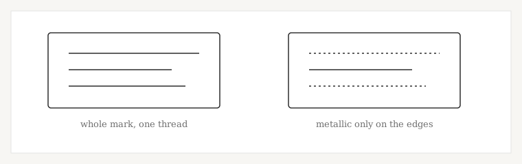
Use this as a first sort, then look at the finished size. A border that is wide enough at jacket scale may be too narrow for metallic at left-chest scale.
| Element | Metallic? | Why |
|---|---|---|
| Wide border or frame | Often yes | Long satin spans let the foil catch light |
| One word in a large column | Often yes | Simple path, few tight turns |
| Small script or a fine line | Usually no | The thread frays and the line looks hairy |
| Filled background | Usually no | Short stitches chew metallic and hide the sheen |
| Tiny counters inside letters | No | The needle perforates the same spot and the foil sheds |
What the file has to change
Split the metallic parts into their own objects and give them their own color. Do not leave them in the same color sequence as the polyester that sews next to them, or the operator has no clean place to change the cone.
Lengthen the satin stitches where the column can take it, and drop the density compared with the same shape in rayon. Metallic does not need the same number of penetrations to cover, and extra penetrations are what shred it. The stitch type still matters: a metallic fill is a different problem from a metallic satin, and a run in metallic is rarely worth it.
Density for the normal-thread parts stays on the fabric you named. Do not lower the whole file because one outline is metallic. The stitch density guide is the place to separate those two decisions.
What to tell the desk
Name the elements that should be metallic, the finished size, and the fabric. If you already buy a specific metallic, name the brand and the weight. If you only have a flat file and want metallic added later, say so — that is an edit of the existing file, not a color note.
Most of these jobs start as logo digitizing. If the metallic is only the border of a cap, the cap file and the metallic objects are still one punch, built for the crown, not a polo file with a gold color swapped in.
Why the stitch itself has to change
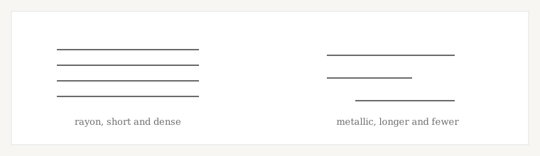
Rayon and polyester cover with short, dense stitches. Metallic covers with fewer, longer stitches. If you leave the metallic objects on the rayon density, the needle punches the foil into dust and the edge looks hairy. If you lengthen every stitch in the file because one border is metallic, the polyester parts of the same logo look loose and snag.
The two threads are two passes. The operator slows the machine for the metallic color and goes back to a normal speed after the stop. That only works if the color stop is real, and if the metallic objects are grouped so the machine is not changing cones every few seconds.
What a bad metallic sew-out usually means
These are starting points. A frayed edge can also be a needle, a tension, or a cheap cone. The file is the first thing to check because a wrong density will shred even a good cone.
| What you see | File issue that may be involved | Also worth checking |
|---|---|---|
| Foil dust and a hairy edge | Metallic sewn at rayon density | Needle size and machine speed |
| The shine never shows | Stitches too short for the foil to lie flat | Column width at the finished size |
| A gold line through the middle of a border | Split points stacked in a row | Whether the satin should have been split at all |
| The operator stops constantly | Metallic mixed into every color sequence | Object order and color stops |
| The rest of the logo looks loose | The whole file was lightened for metallic | Density on the polyester objects |
A border that works, and a script that does not
A 6 mm satin frame around a jacket mark can carry metallic. The path is one direction, the spans are long, and the frame is its own color. The same gold on a 3 mm script at left-chest size will not. The turns are too tight and the column is too narrow, so the foil frays and the word stops reading. That script stays in polyester. The frame can still be metallic. That split is the whole point of this page.
Size changes the answer. A border that is legal on a jacket back can be too narrow once the same art is reduced for a chest. Finished size belongs on the brief, next to which elements are metallic. Placement notes for that chest are in the left chest size guide.
Ready when you are