A puff column is a satin sewn over foam. The foam is what lifts. The stitches are what hold that lift and then stop it from growing forever. Too narrow and the foam never gets a chance to rise, because the needle has already chopped it into a flat scar. Too wide and the column bites a trench: the edges pull in, the middle collapses, and the letter looks chewed instead of raised.
Width is the whole trick
There is no universal millimeter that works on every foam. The column has to be wide enough for the foam thickness you are actually sewing, and narrow enough that the satin can still tie the edges down. A letter that looks bold on screen can be a trench on a 3 mm foam, and a letter that looks delicate can be too thin for any foam at all.
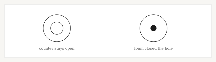
Inner counters stay open. Filling the inside of an O or a B with puff foam is how those letters close up and stop reading. The foam belongs under the stroke, not under the hole.
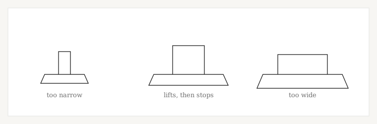
| What you see | What the column did | What to change |
|---|---|---|
| The letter is flat, foam scraps on the surface | Column narrower than the foam can rise through | Widen the stroke, or drop the foam |
| The letter lifts, then holds a clean edge | Width matches the foam and the satin ties it | Leave it |
| A trench down the middle of a wide letter | Spans too long, edges pulled in | Narrow the column or split it |
| Counters filled in, the letter looks solid | Foam and satin ran into the hole | Keep the counter open |
| The cap front is buckled around the word | Too much stitch, or puff on too many elements | Puff only the parts that should lift |
Puff is not a setting on a flat file
3D puff digitizing is its own construction. You cannot take a flat cap file, tell the machine to use foam, and expect the columns to lift. The satins were sized for thread on fabric, not for thread over foam. The stitch types page says the same thing in one line: do not carry ordinary satin widths across to puff.
Thin script should stay flat, or it should leave the cap. A structured crown already has a registration problem of its own, covered in why cap designs drift. Adding foam to every element makes that pull worse.
What to write on the quote
Finished letter height, the foam thickness if you already buy one, and whether the cap is structured or unstructured. If the same mark also sews on a polo, that is a second file. The puff widths will look wrong on a shirt, and the shirt density will chew the foam.
If you are not sure the letter is wide enough, send the artwork anyway. We would rather tell you the stroke has to grow than deliver a file that sews flat.
The counter is part of the width decision
A letter lifts along its stroke. The hole inside an O, a D, or a B has to stay empty. If the foam and the satin run into that hole, the letter becomes a blob and the lift looks like a lump instead of a column. Closing the counter is the failure people blame on “too much puff.” It is usually the shape: the stroke was drawn so wide that the hole disappeared before the machine ever sewed.
The same rule is why a thin script should not be puff. There is no counter to save and no width for the foam to rise through. Leave the script flat, in a normal satin, and puff the one word or the one border that has the width.
Foam thickness against column width
Thicker foam needs a wider stroke before it can rise, and it trenches sooner if you keep widening past what the satin can tie. Name the foam. A guess at “standard puff” is how a 2 mm foam and a 5 mm foam get the same columns.
| Foam | Column | What sews |
|---|---|---|
| Thin foam, narrow stroke | Too little room to rise | Flat letter, chopped foam |
| Thin foam, moderate stroke | Enough to lift, short enough to tie | A low, even raise |
| Thick foam, moderate stroke | Foam taller than the satin can control | Uneven lift, edges not tied |
| Any foam, very wide stroke | Spans too long | A trench down the letter |
| Foam inside a counter | The hole was filled | A solid blob |
Cap puff and a polo are two files
The cap wants short, wide columns and a center-out path, because the crown is already moving. The polo wants normal satin widths and a light underlay. One file cannot be both. If the brand uses the same word on a hat and a shirt, order the puff cap and the flat chest separately. Carrying puff widths onto pique makes a stiff, chewed chest. Carrying shirt widths onto foam makes a flat hat.
Structured or unstructured belongs on the quote too. An unstructured crown collapses under a heavy puff word that a structured front will hold. Say which cap you are sewing before the columns are drawn.
Ready when you are